

by Chris Schwinden, on Apr 10, 2026 7:00:00 AM
If you’re not growing, you’re dying. That saying is especially (and literally) true when talking about workforce. Population growth or decline is the basis on which a state, region, or community can build a strong workforce value proposition. And it’s also one of the simplest, but most important data points Site Selection Group uses to evaluate current and future workforce potential for our manufacturing clients.
The U.S. Census Bureau recently published county-level population estimates that provide new insights into key population and workforce trends across the country. The headlines are clear: Foreign immigration has plummeted over the past year, and you can read more about that here, or here, or here. This new data is a good place to look at which areas of the country are growing, and more importantly, what’s driving their population growth.
We’ll do this through five relatively simple maps that show which counties across the country are growing. More specifically, we’ll look at the three key components of population growth: domestic migration, international migration, and natural growth (i.e., more births than deaths). And although the huge one-year drop in international migration has been covered everywhere else, we’ll look at five-year trends to smooth some of the “lumpiness.”
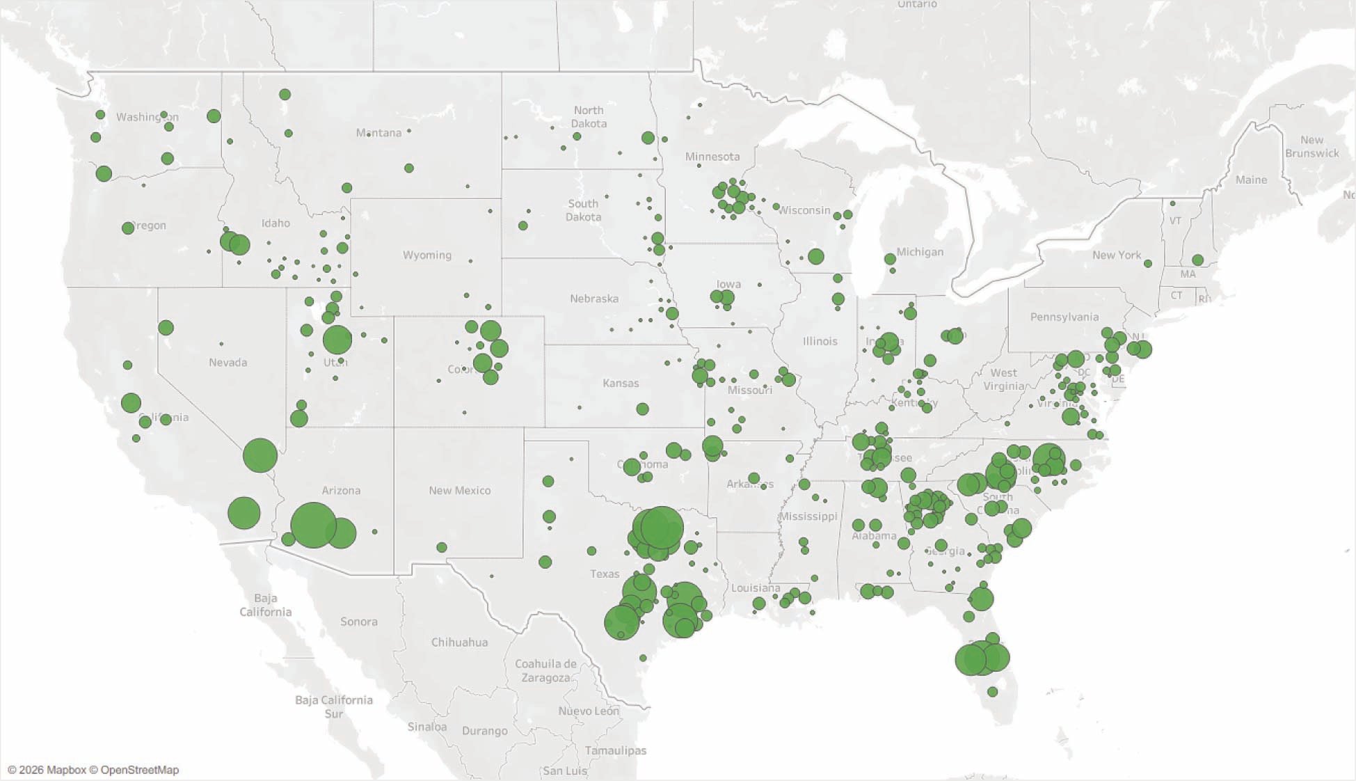
1. Starting Point: Counties with Positive Population Growth Since 2020
First things first. Let’s look at counties that have had positive population growth since 2020. That is shown on the map here, with bubbles sized by counties’ absolute population growth over the past five years (e.g., Dallas has had more absolute population growth than Fargo, North Dakota). We’ve filtered out counties that have had population declines.
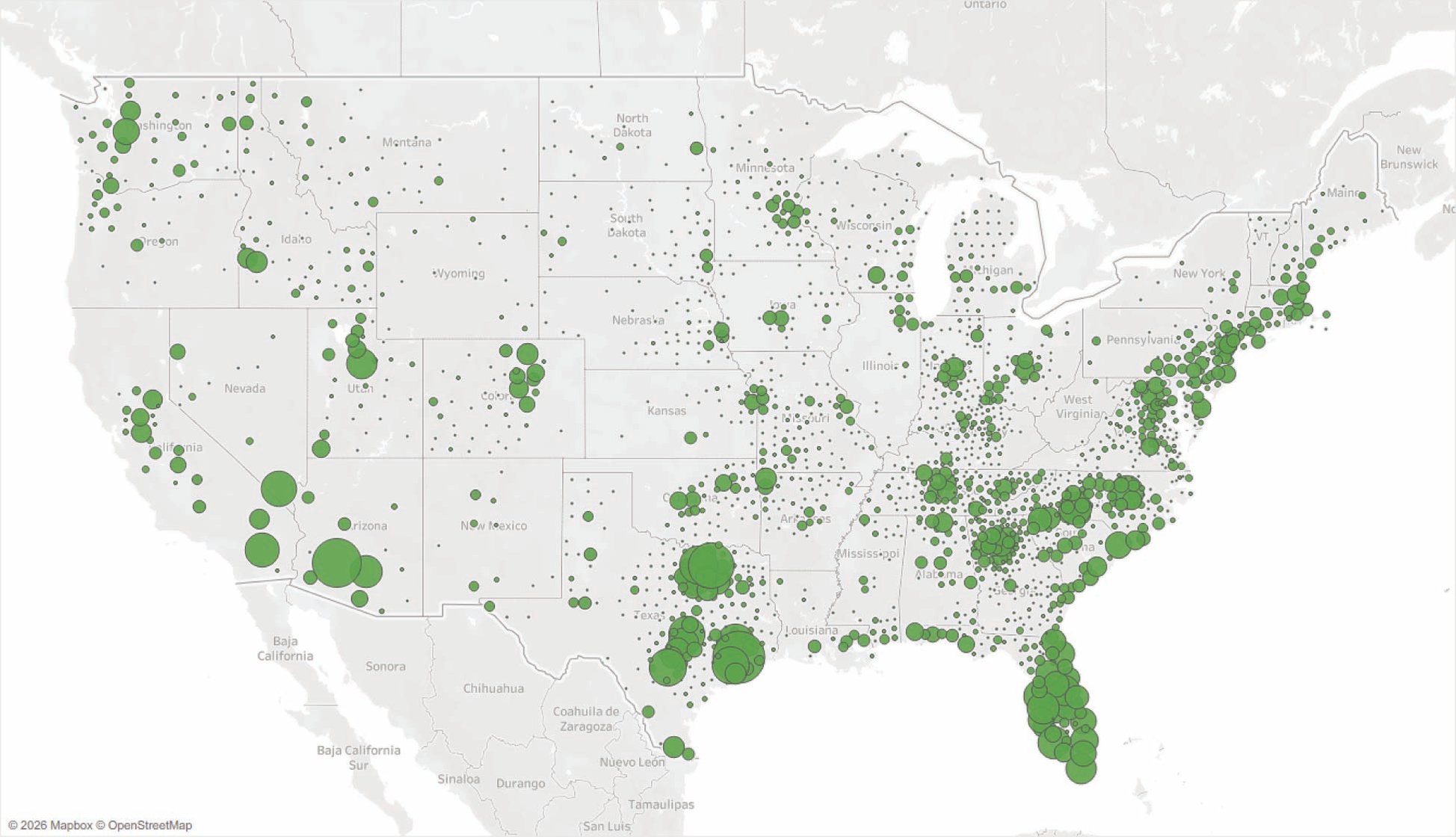
Most are familiar with the overall trends shown on this map, with significant growth in the Sunbelt, specifically in Texas, Florida, and the I-85 corridor from Georgia through South Carolina and North Carolina. Also, the Mountain West has grown considerably. But this is also a good reminder that smaller and mid-sized metros in the Midwest have grown as people continue to migrate from rural areas. And finally, there has been positive population growth in more urban markets in the Northeast Corridor.
2. Biggest Driver: Domestic Migration
The biggest driver of population growth for most counties is domestic immigration, that is, people moving from one county to another. The map here sizes those bubbles by counties that have had positive domestic immigration over the past five years.
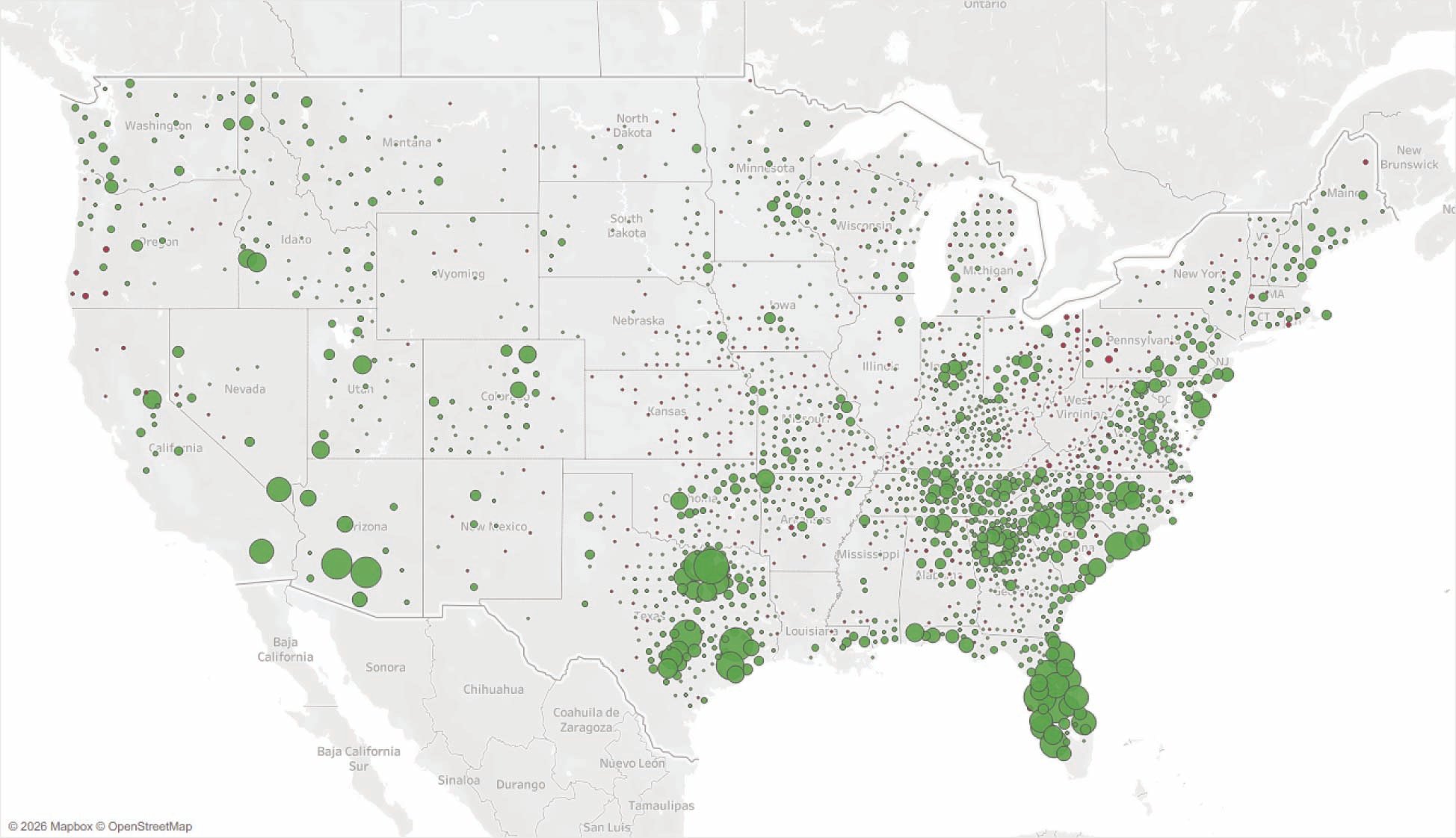
Overall, it looks similar to the overall growth map shown previously. But if you squint, you’ll notice that there are a few more tiny bubbles on this map. That’s because many rural counties have experienced small population influxes (often from neighboring counties) but still show negative overall growth. As a result, we’ve color-coded these counties in red to show that they have continued to decline in population overall. You’ll also notice that many of the bubbles in the Northeast corridor have disappeared, as core urban counties continue to see residents move away (whether to the suburbs or to Florida).
3. In the Headlines: International Migration
This is where things start getting a little more interesting. Here, we map counties that have had positive international migration over the past five years and size the bubbles accordingly.
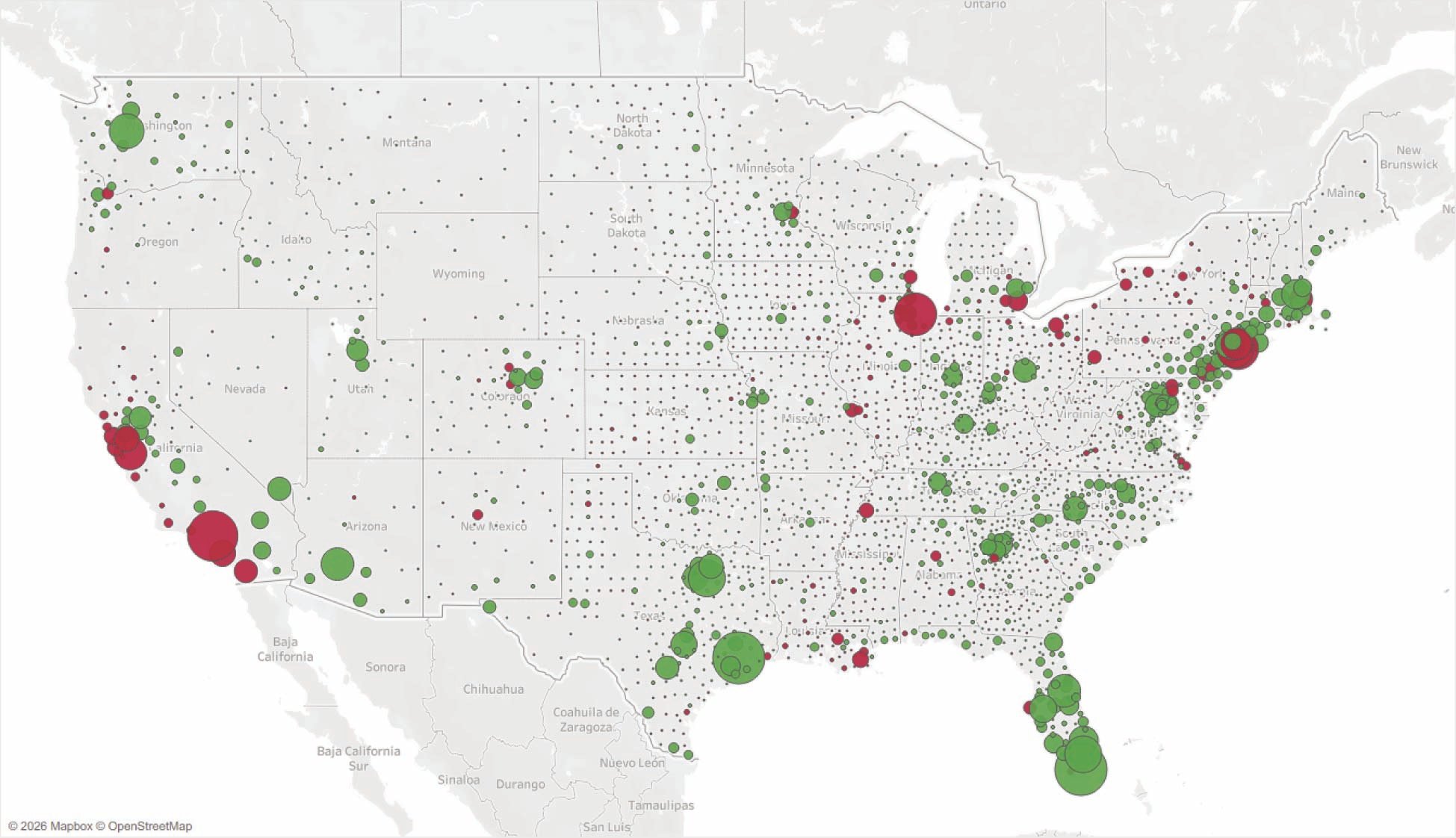
Again, we see counties with high growth overall also benefiting from high international immigration (e.g., Texas, Florida). But we also see some very big red bubbles in major metro areas: New York, Chicago, and several metros in California. Using our red/green color coding from above, these are counties that have had negative overall population growth, but very high international immigration. You’ll also notice that there are a lot of small bubbles on this map. Rural counties across the country are declining overall, but international immigration has (somewhat) stemmed that tide.
4. The Most Important: Net Natural Growth
The final component is the smallest, at least in the United States, where overall the population is aging. But it’s also the most important as it shows natural growth, that is, counties where births exceed deaths. This map sizes those bubbles by the net natural growth.
The first thing you’ll notice is that the bubbles are much smaller than on the other maps. That’s because natural growth is a much smaller part of growth overall. You’ll also notice that the number of bubbles on the map is smaller, as there are fewer counties where natural growth is positive. Finally, you’ll notice that there are virtually no red bubbles on this map—that is, counties with negative overall growth, but positive natural growth. Here, we see many regions with overall high growth, such as Texas, the Southeast, and the Mountain West. But you’ll see that areas like the Central Valley of California have pockets of growth, as do small and mid-size markets across the country. This shows that natural growth in places like Florida is much more isolated to markets like Orlando and Tampa.
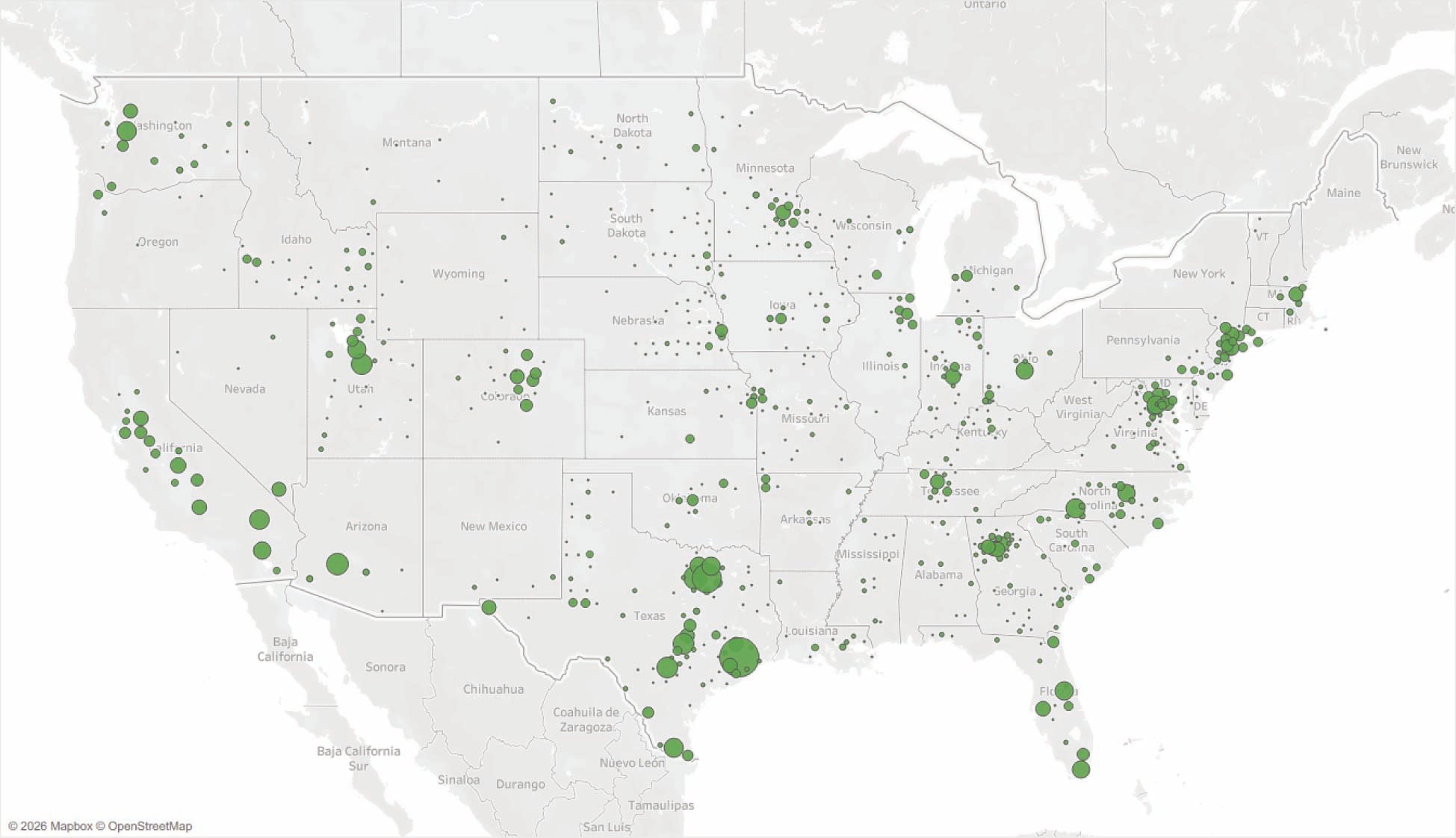
5. Pulling it Together: Positive Growth for All Three Components
Finally, let’s pull it all together. We'll go back to that first map where we size bubbles by overall growth, but then further filter the map to counties that have positive domestic immigration, positive international migration, and natural growth.
Here, we see the same growth in Texas, the Mountain West, and the Sunbelt, but far fewer retirement-driven markets in Florida and along the coasts. We also see many counties in the northeast disappear. And despite overall regional trends of population shifting south, there are many pockets of small- and mid-size markets across the country that are showing positive trends.
And for one final summary to go from five maps to three bullets:
- When doing workforce evaluation for site selection, it’s critical to start with baseline demographic evaluation, but also go beyond headline growth numbers.
- There are growth markets scattered across the country and not just in the Sunbelt. So, if logistics considerations drive a manufacturing or distribution project to one region of the country, there are favorable workforce conditions everywhere.
- And thank you to all the public servants at the U.S. Census Bureau and all our national, state, and local data agencies for producing high-quality data that we use every day to help our clients make effective site selection decisions.
